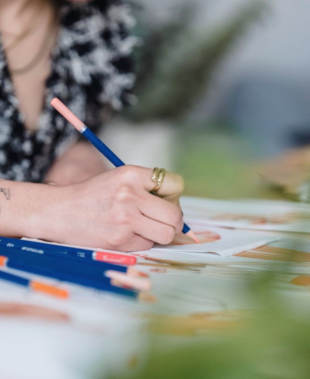
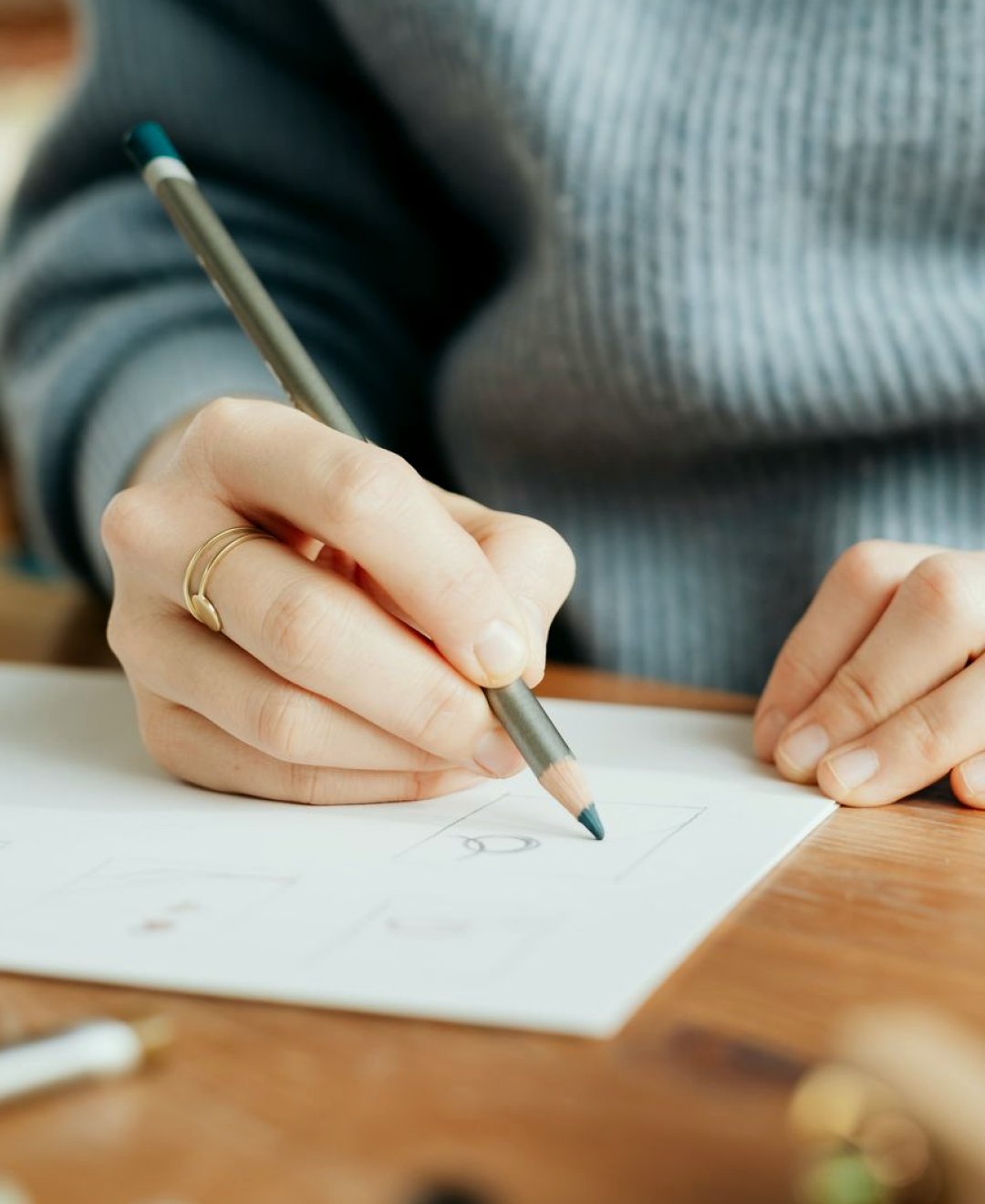
Two ways to draw the same scene
When students first reach the drawing module, they usually ask whether a storyboard has to look good. It does not, but there are two common styles worth comparing. The first is the thumbnail board: small, quick frames the size of a postage stamp, drawn in a few minutes each. The second is the finished panel: a larger, cleaner drawing with more detail, shading and sometimes colour.
Both styles do the same job. They show where the camera sits, what is in the frame and what happens in it. The difference lies in how long they take to make and how much they invite you to polish rather than plan. I teach framing and lighting, so I look at boards from the camera operator's side, and the question I ask is simple: could I set up this shot from the drawing alone?
In the Storyboard Drawing Basics module we try both on the same short interview scene, so students can feel the difference in effort and in usefulness rather than taking my word for it.
What thumbnails do well
Thumbnails are fast, and speed changes how you think. If a frame takes two minutes, you will draw five versions of the opening shot and pick the best. If it takes twenty, you draw one and defend it. For a factual report, where the order of shots and the cutaways matter more than the beauty of any single image, that freedom to try alternatives is the real value.
A thumbnail board also fits on one sheet. You can lay out a whole interview sequence side by side and see the rhythm at a glance: wide, medium, close, cutaway, back to medium. Gaps show up quickly. A common finding is two close-ups in a row with nothing to cover the edit between them.
Thumbnails are also easy to throw away. Nobody feels bad scrapping a rough frame, so changes happen early, while they are still cheap, and long before anyone is standing in a cold car park waiting.
- Quick enough to draw several versions of one shot
- A whole sequence fits on a single sheet
- Easy to discard and redraw without regret
What finished panels do well
Finished panels earn their place when someone other than you must act on the drawing. A larger panel can show the edge of a window, the direction of a shadow or the height of a lamp stand with enough clarity that a colleague who was never in the planning conversation understands it. If you hand a board to a freelance sound recordist or a volunteer assistant, extra detail saves a phone call.
They also help when you need approval. A manager or a contributor who is not used to reading rough sketches often reacts better to a tidy frame. It looks considered, even if the thinking behind it is the same as the thumbnail.
The risk is time. I have watched students spend an hour shading one panel and then discover the location has no room for that camera angle. The drawing was lovely and the plan was wrong, which is the wrong way round.
Where both styles fail
Neither style works without annotation. A drawing of a person in a chair tells me very little unless it is marked with the lens, the camera height, the direction of the light and the line you expect to be spoken. Short notes in the margin turn a picture into an instruction, and teaching students to write them is half of the module.
The other shared failure is drawing what you wish you had rather than what the location allows. A board that places the camera three metres behind the interviewee is useless if the room is two metres deep. This is why the drawing lessons sit beside the location and floor plan exercises, so the boards are checked against real measurements.
Finally, both fail when nobody reads them. A storyboard is a working document. If it sits in a folder on the shoot day, it has cost you time and given nothing back.
- Add lens, camera height and light direction to every frame
- Check each frame against the real size of the room
- Take the board with you on the day and mark changes
Our recommendation for beginners
Start with thumbnails, always. For beginners and early-career video makers working on interviews, short reports and small factual pieces, rough boards give you most of the planning benefit for a fraction of the effort. Draw the full sequence in thumbnails first, annotate it properly and test it against your location notes.
Then ask a single question: will anyone besides me need to act on this board without me in the room? If the answer is no, stop there. If the answer is yes, redraw only the frames that carry real risk, such as an unusual angle, a tight space or a moving shot, as larger panels. Leave the routine frames rough.
This hybrid keeps you honest about time. It also builds the habit we care about most on the course, which is deciding before the day rather than improvising on it, with a board your crew can read in under a minute.
A short autumn exercise to try
These weeks of low, changing light are a good moment to practise. Pick a corner of your home or office with a window and imagine a two-minute interview. Draw six thumbnails: an opening wide, two medium frames, a close-up and two cutaways. Keep each to a couple of minutes and give every frame a one-line note.
Now redraw only the closing cutaway as a finished panel, including the light from the window and where it will fall at the time of day you would really film. Compare the two. Notice which drawing helped you decide something and which one simply looked nicer.
If the thumbnail version taught you more, that is normal, and it is the point of the exercise. Keep the pair of sketches somewhere visible so you remember how little detail the decisions actually needed.
Thumbnails and finished panels are not rivals, but they are not equals for a new filmmaker either. Thumbnails let you plan quickly, change your mind cheaply and see a whole sequence at once, while finished panels are worth the hours only for the few frames others must act on without you. Draw rough first, annotate every frame and polish only where the risk is real. Your crew will thank you for clarity, not for shading.